Optimizing Online Merchadising with Image Gallery
-
Design your best product layout
A product layout is like a digital storefront. To leverage the benefits of the image gallery, you should create a layout scheme that focuses on enhancing user experience. Here are a few recommendations for you.
-
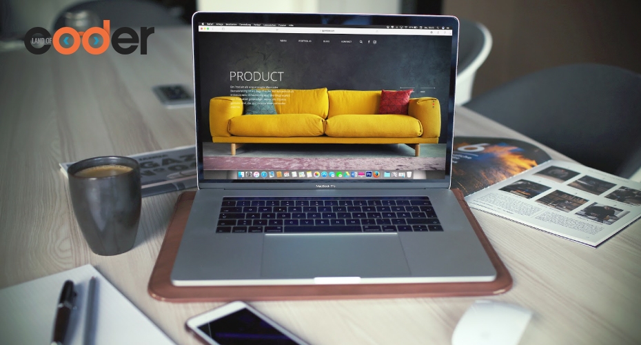
Make use of the “above the fold”
The “above the fold” is the part of a webpage that is visible when visitors first land on the website. This portion attracts nearly 80% of all visitors’ attention on most sites. Taking advantage of this fact, you need to get your priorities right, especially when you are in a sales promotion campaign. Before deciding what to put anything on the “above the fold”, you should state a clear and single-minded objective. Whether it is increasing sales of a particular product, engaging a different audience, or promoting brand images will decide what you display in this area.

If you want to boost sales, then you can show the latest sales, best selling products, or new arrivals,...in this area. Look at how Amazon makes it.

Or you can also put your brand image or a new lookbook to reinforce your brand image. Check out Adidas landing page.

Consider to add a slider if you have many offers or images to show for the sake of customers’ experience. Alibaba has a slider, too.

-
Apply a grid-based layout
The grid layout is used by most online stores such as Amazon, Best Buy, and Flipkart. The main reason why grid layout is so popular in web design is that it scales well and makes use of the white space effectively. Further, it gives your site a fresh clean look and more visually appealing. Thus, it improves visitors’ experience when they views the image gallery, attracts more visitors to your website and encourages them to stay longer. When applying this layout, you should keep the boxes equally sized as it is proved to boost revenue per visitor by 17%.

-
Utilize a customer-focused navigation
Your navigation bar should be separated into product or service categories. By that, customers will have the feeling of plentiful choices without being overwhelmed. To create a well-organized navigation bar, you need to list out all your products and sort them into categories and subcategories. This will helps customers find what they want fast and easily. Also note that your navigation bar should be on top of all product listings.

Further, add breadcrumbs below the navigation bar in order to orient customers by telling them what category they are in and how to return to homepage or previous pages.

-
Use high-quality images
Online shopping is time-saving, convenient and cheaper than going to brick-and-mortar store. The only one thing that hinders shoppers from buying online is the lack of touch-feel-try experience. Customers love walking around the store, looking and touching to feel the materials and the details on the products and to make comparisons before buying. Though this first seems impossible in the cyber environment, there is an alternative - high quality images. With the help of media software and good photography, customers can examine the tiniest details of the products and see the final product in the materials or colors of their choice instead of selecting a swatch and imagining how it will look on the finished one as in the offline store. Thus, it is important that every photo and picture in the your image gallery be at the best quality to make customers feel comfortable and reliable, create a resonance in their mind and bridge the touch-and-feel barrier.

-
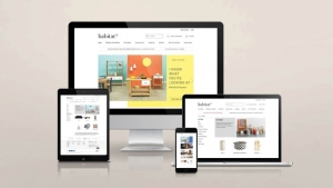
User friendly and mobile responsive
As more and more people go shopping online on their phones or tablets, make sure your ecommerce merchandising is mobile-friendly. All your page content must fit and look perfect in any kinds of screen, especially your image gallery in all category pages. Mobile responsiveness is very important as it affects image quality and ultimately, customer experience.

-
Create genuine customer experience
Whether it is a product, service, or an experience, online consumers want to know what they are going to get before making any further decisions. They tend to trust recommendations from the people they know or other online customers. A study shows that 30 percent of millennials won’t go to a restaurant if its Instagram presence is weak. In other word, customers trust other “user-generated contents”, the contents (text, videos, images, reviews…) created by customers rather than brands. Customers take and share images featuring your brand, exposing your products to other people in their network. Instagram is the prime source for user-generated content for most brands.
Adidas has “share how you wear it” on every product page to show UGC.

You can build a customer Instagram image gallery and attach Instagram hashtags on each product page to show how the products look in real life and encourage other shoppers to be involved and share their experiences. Making use of user-generated content is one of the key marketing strategies that promotes product authenticity and credibility, builds customer trust, and drives more sales.

3. Examples of great-looking merchandising with image galleries
-
Old Navy
The Americana apparel and accessory brand empowers its customers to curate brand content through its #SayHi campaign on Instagram. Images approved are then uploaded to a social gallery on the Old Navy’ website, where visitors can have credible testimonials from other customers. This fabulous image gallery encourages customer engagement and proves an authenticity for the brand’s products.
Detailed, high quality photos of happy customers wearing Old Navy clothes with amazing facial expressions is the best social proof for the product quality and the trust of customers.

-
Shopee
E-commerce giant Shopee uses grid layout with equally-sized boxes to show its products in a well-organized, clean and colorful design that adapts a smooth mobile online shopping experience. Basic product information including product name, price and the number of sold ones helps visitors easily scan through a wide range of products. It is clear that Shopee has leverage the grid-based layout to make use of all the website space creating a sense of plentiful choices for customers.

-
ETQ
The footwear brand ETQ applies the “less is more” philosophy for its web design and image gallery as well. The space among the product images without border lines creates a more casual visual flow and attract all the attentions for the products. Transmitting the value of elegance and quality, ETQ web design is a full of modern and minimalist beauty, with simple layout and subtle animations enough to make it stand out.

Conclusion
When it comes to online visual merchandising in E-commerce, it’s best to have an Image Gallery with high quality your product images categorized thoroughly and organized in a standard grid layout. It is even more effective to drive sales when you implement the user-generated content marketing tactics. The best web design is the one that brings the customer experience to the next level. The best tips shared above works for most online stores. If you need more helps for an image gallery feature in your site, don’t hesitate to contact us.
Author


Oct 30, 2019
Oct 30, 2019